A calmer SNCB app for autistic passengers: less on the screen, simpler navigation, and filters to choose what you see.
- Year
- 2025
- Team
- 4 people
- Role
- Design direction, most of the screens, inclusive design
SNCB app redesign
- Length
- One semester
- Type
- Mobile app concept
- Focus
- Accessibility, UX/UI design, Inclusive design
- Tools
- Figma
A train app that stays calm
Find a group that an existing app doesn’t serve well, and design around their needs.
Train apps can overwhelm autistic passengers: too much information, strong visuals and complicated navigation.
An SNCB app concept with simpler navigation, a calmer interface and filters. I set the main design direction and designed most of the screens.
Too much at once
We read about the needs of autistic people and how common app patterns can add stress: dense screens, strong colours and too many steps.
Still SNCB
We sketched first, then made wireframes in Figma. We kept SNCB’s brand and made it quieter, instead of inventing a new one.
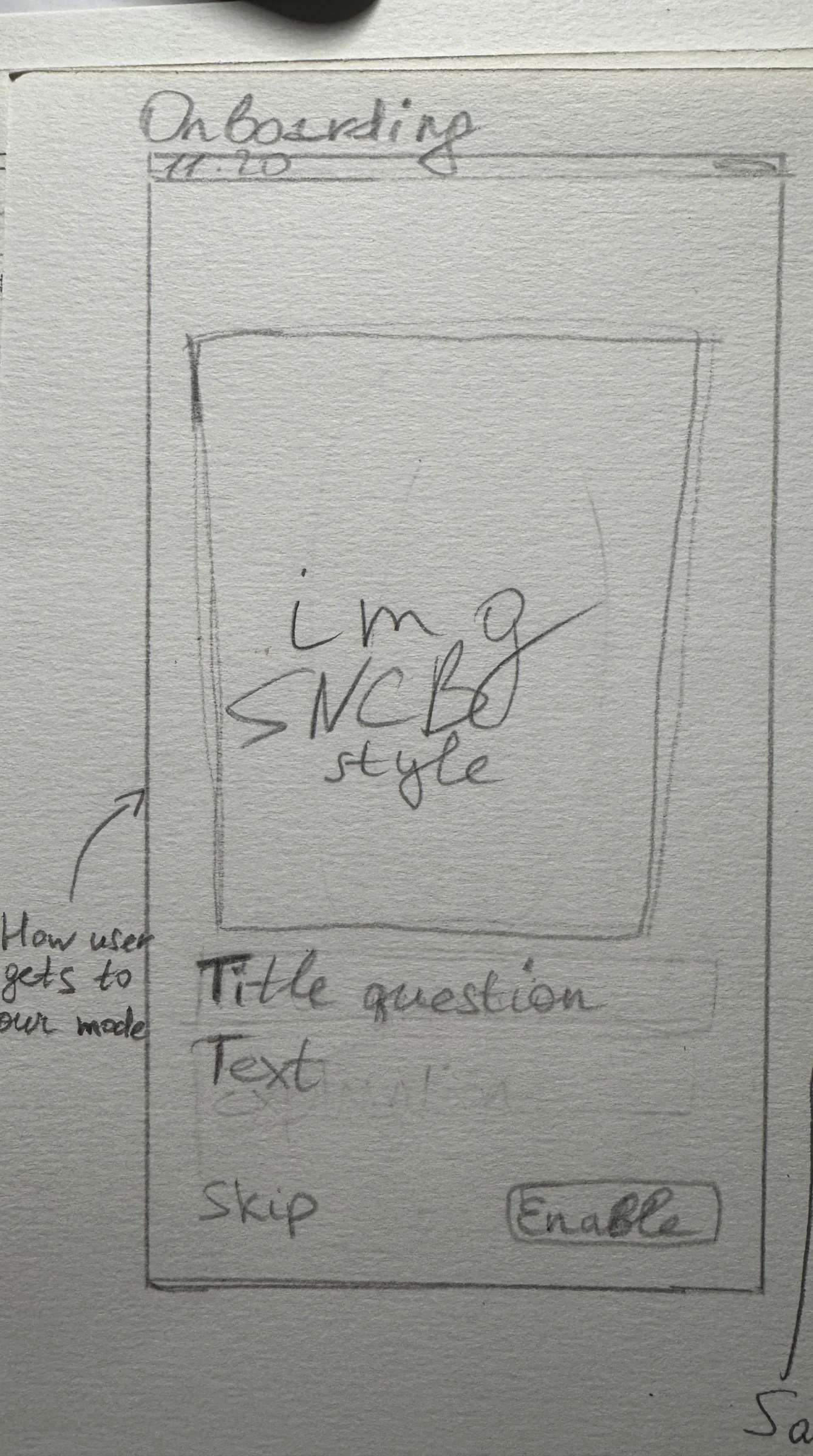
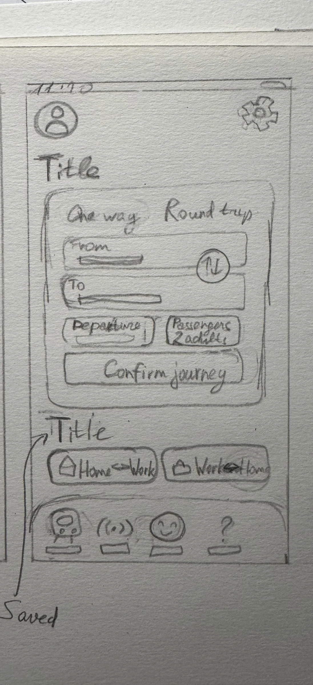
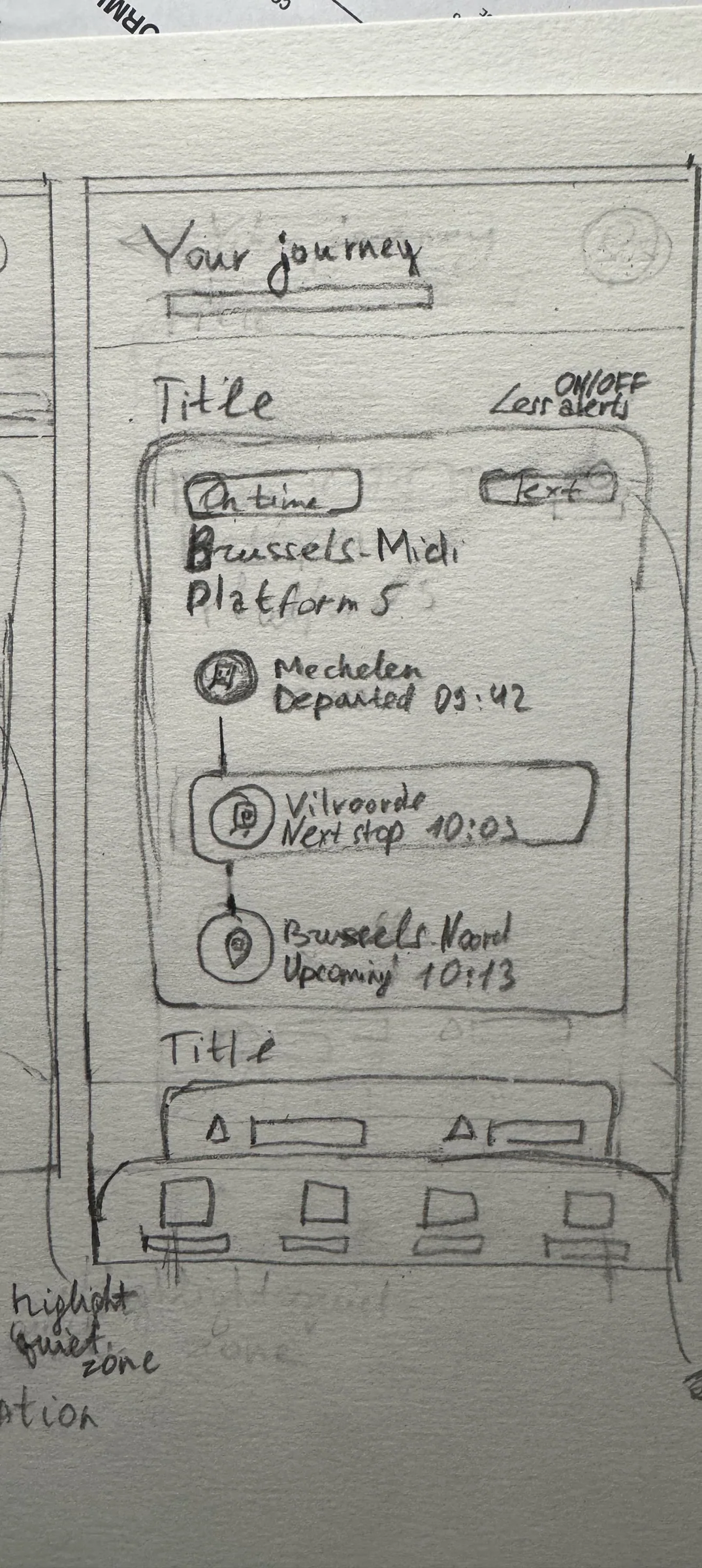
Fewer things asking for attention
Soft blues, fewer elements, nothing that moves without a reason.
The type is Plus Jakarta Sans. We added a set of soft accessibility shades for highlights.
Calm Mode gives quieter visuals and gentle notifications, and lets you change the text size and contrast. When you look for a train, you can filter for a silence zone, direct trains only and accessibility, and each train shows if it’s less busy.
The decisions that mattered
- 01A group that gets forgotten
We designed for autistic passengers instead of another app for everyone.
- 02Less stimulation
Calmer colours and a simpler hierarchy, so nothing pulls at you.
- 03Filters you control
People choose which travel information they see.
Ask the people themselves
This project showed me needs I had never thought about, and made me question app patterns I use without thinking.
Next time I’d test with autistic passengers themselves, not only read research, because everyone’s sensory needs are different.
I used AI to check the colour contrast and to double-check that my research was correct.
Bubbly