A seasonal living app with local produce, recipes and activities for where you are and what season it is. I led the development, and we tested it with 10 people.
- Year
- 2026
- Team
- 3 people
- Role
- Lead developer, Scrum Master, user testing, UX/UI fixes
Livio
- Length
- One semester
- Type
- Mobile app
- Focus
- Development, User testing, Product design
- Tools
- FigmaVS CodeClaude Code
From a concept to a working app
A teammate created Livio as a digital sub-brand for Burt’s Bees. Our team of three turned it into a working app, tested it and improved it.
I was the lead developer and our Scrum Master. I also took part in the UX discussions and suggested fixes after testing.
A working, responsive app with local produce, recipes, activities, things to learn and bookings, improved after testing.
Bringing it to life
I built the app in VS Code with Claude Code, starting from our Figma designs. The first version was a prototype for phones only. Now it’s responsive, and everything in it is real: produce, recipes, activities and their images come from live data (images from Cloudinary) and change with the current month.
It works in English, Dutch and French, makes up a random nickname and avatar if you don’t add your own, and has a voice search connected to AI.
Ten people, three scenarios
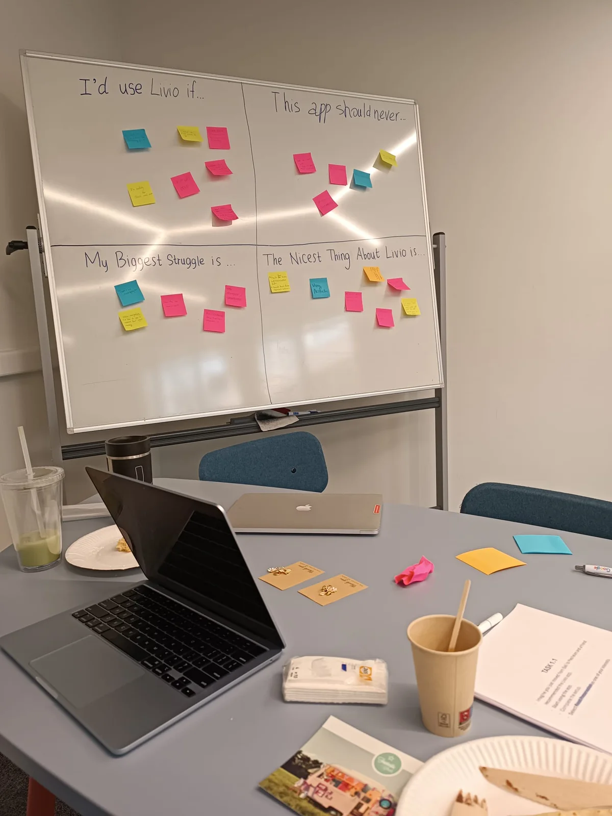
We watched 10 people of different ages and tech levels go through three scenarios, and wrote down every problem, comment and surprise.
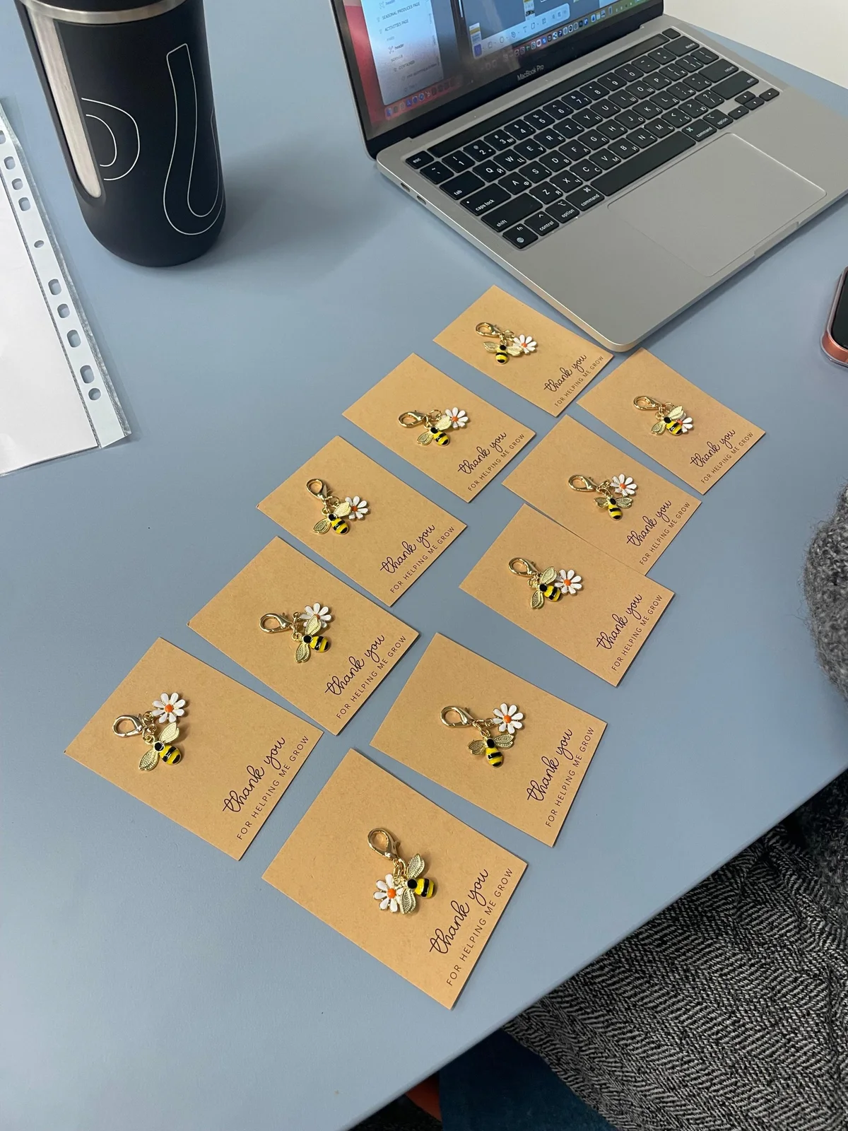
We set up the test day in Livio’s brand style, and every participant got a small thank-you gift. People who didn’t want to say things out loud could leave notes on a feedback board.
- 10
- participants
- 3
- scenarios
- 5
- things to fix
They liked the idea and the look. But the home screen showed too much at once, the navigation was confusing, and they missed search and filters.
Five problems, all fixed
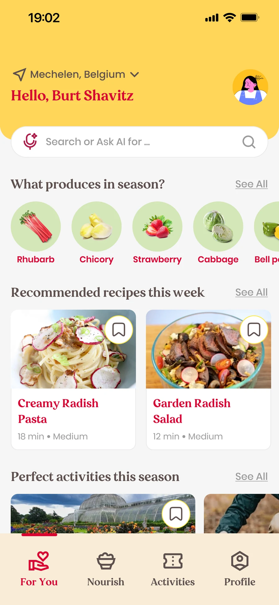
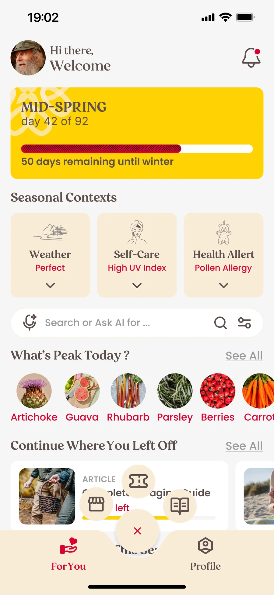
The test showed us five problems. We fixed all of them in the new version.
- 01
Too much on the home screenThe home screen now shows what people need first, not everything at once.
- 02
Bookings hard to findBookings now appear in the bookings section and in your profile.
- 03
No search or filtersSearch and filters are now on every page.
- 04
Unclear icons and labelsWe renamed and fixed the icons and labels.
- 05
“In season” was confusingWe removed it. The app now shows what fits your season right away.
The decisions that mattered
- 01A simpler order
We put the things people needed most first.
- 02Easier to find
The test showed us where important features should live, so bookings, search and filters moved there.
- 03Decided together
As lead developer and Scrum Master I proposed UX fixes, and the team agreed on the final direction.
Test earlier
People found the app more complicated than we expected. Next time I’d test before building so many features.
I wrote the code with Claude Code in VS Code. AI also helped me sort the test notes and write the report. The testing was with real people, and our team made the decisions.