A browser extension for Oatly that helps home cooks swap dairy for oat, right on the recipe sites they already use.
- Year
- 2025
- Team
- Solo
- Role
- Research, strategy, branding, UX/UI, motion
The Oat
- Length
- One semester
- Type
- Browser extension, sub-brand of Oatly
- Focus
- Branding, UX research, Browser extension
- Tools
- FigmaIllustratorAfter Effects
Oat milk in coffee, not in recipes
A school project for Digital Product 3: take an existing brand, find a real problem and design a digital product for it. I chose Oatly.
Flexitarian home cooks happily put oat milk in their coffee. In a recipe they’re afraid it will ruin the taste or the texture.
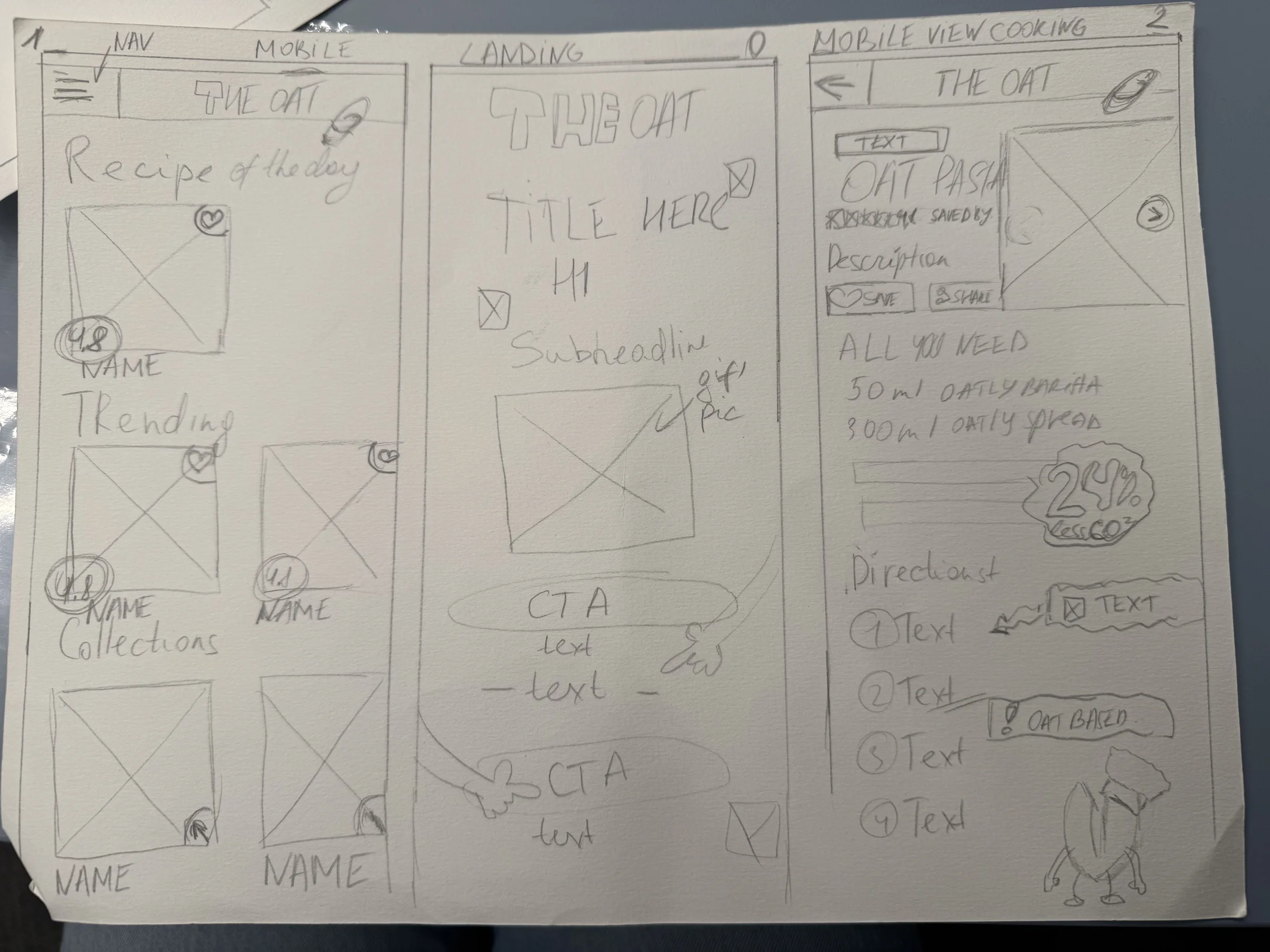
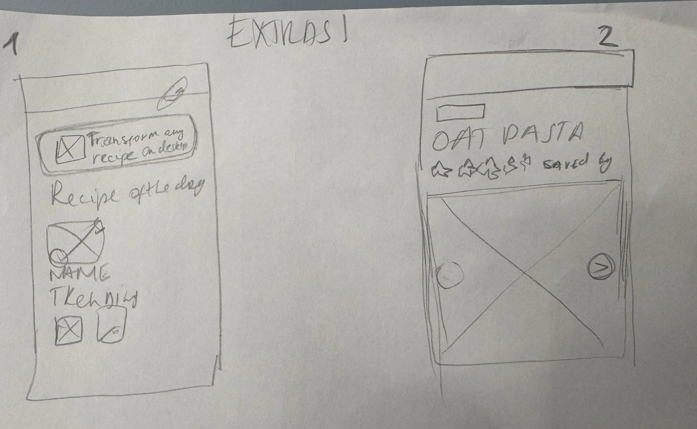
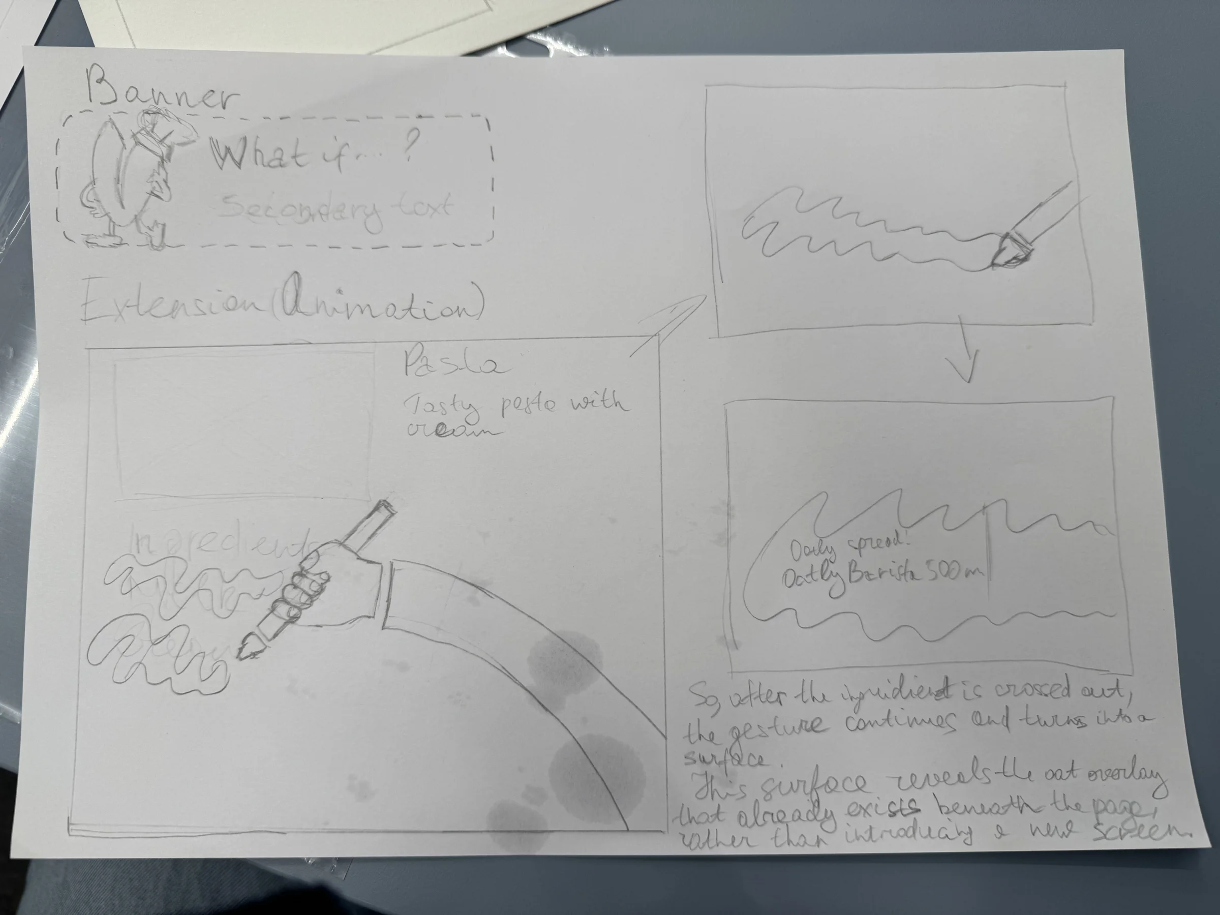
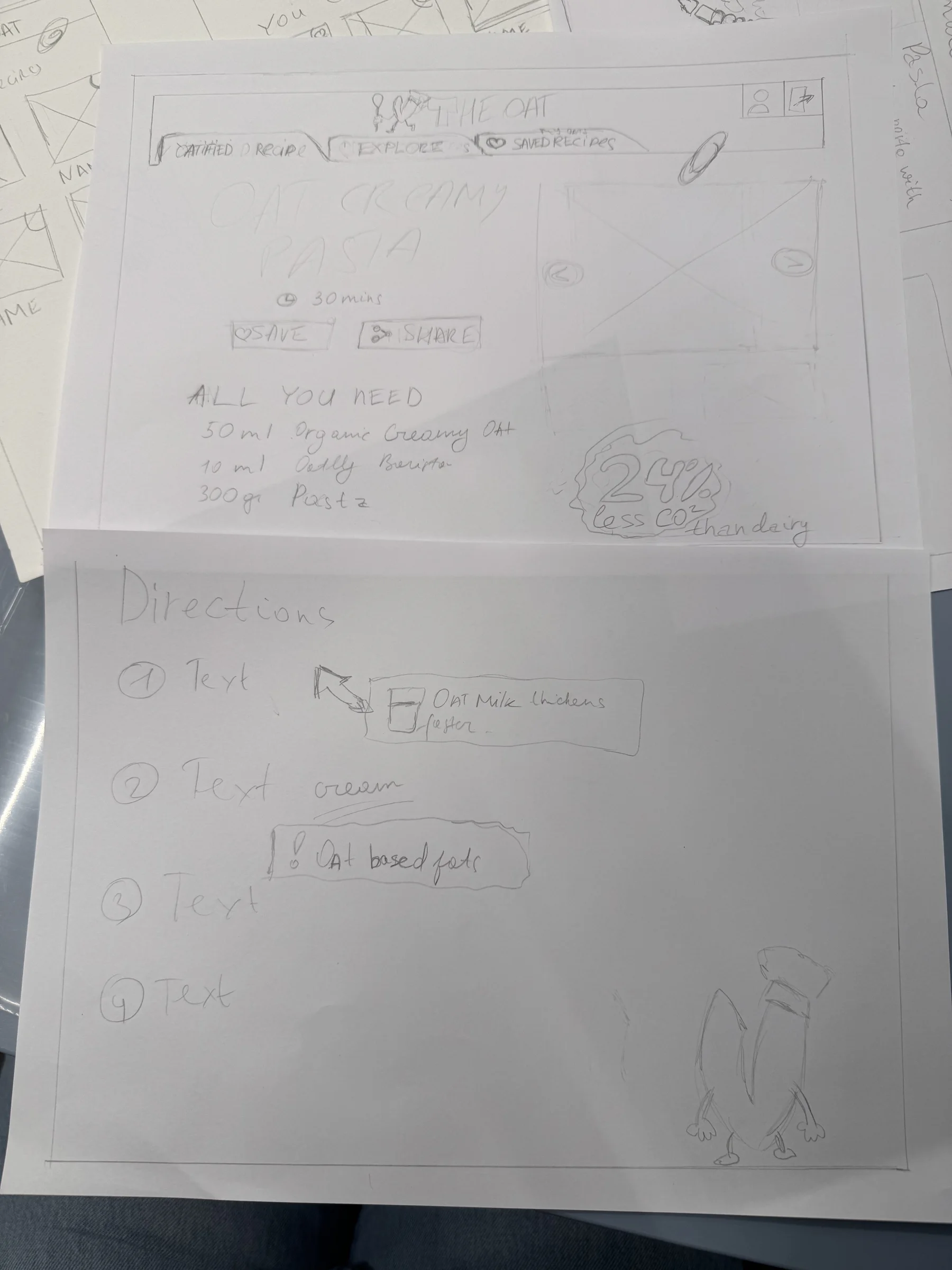
An extension that spots dairy in a recipe, suggests the oat swap, explains how to cook with it and saves the new recipe.
The problem was confidence
I studied Oatly’s market (Alpro, Minor Figures, supermarket brands and dairy) and read cooking threads on Reddit and Facebook. Then I talked to people.
- 3
- interviews with flexitarians
- 52
- people answered my survey
- 67%
- felt unsure about replacing dairy
- 75%
- preferred my idea to searching for advice
People didn’t lack motivation. They were afraid to waste food, money and time on a dish that doesn’t work.
Eight directions for one oat
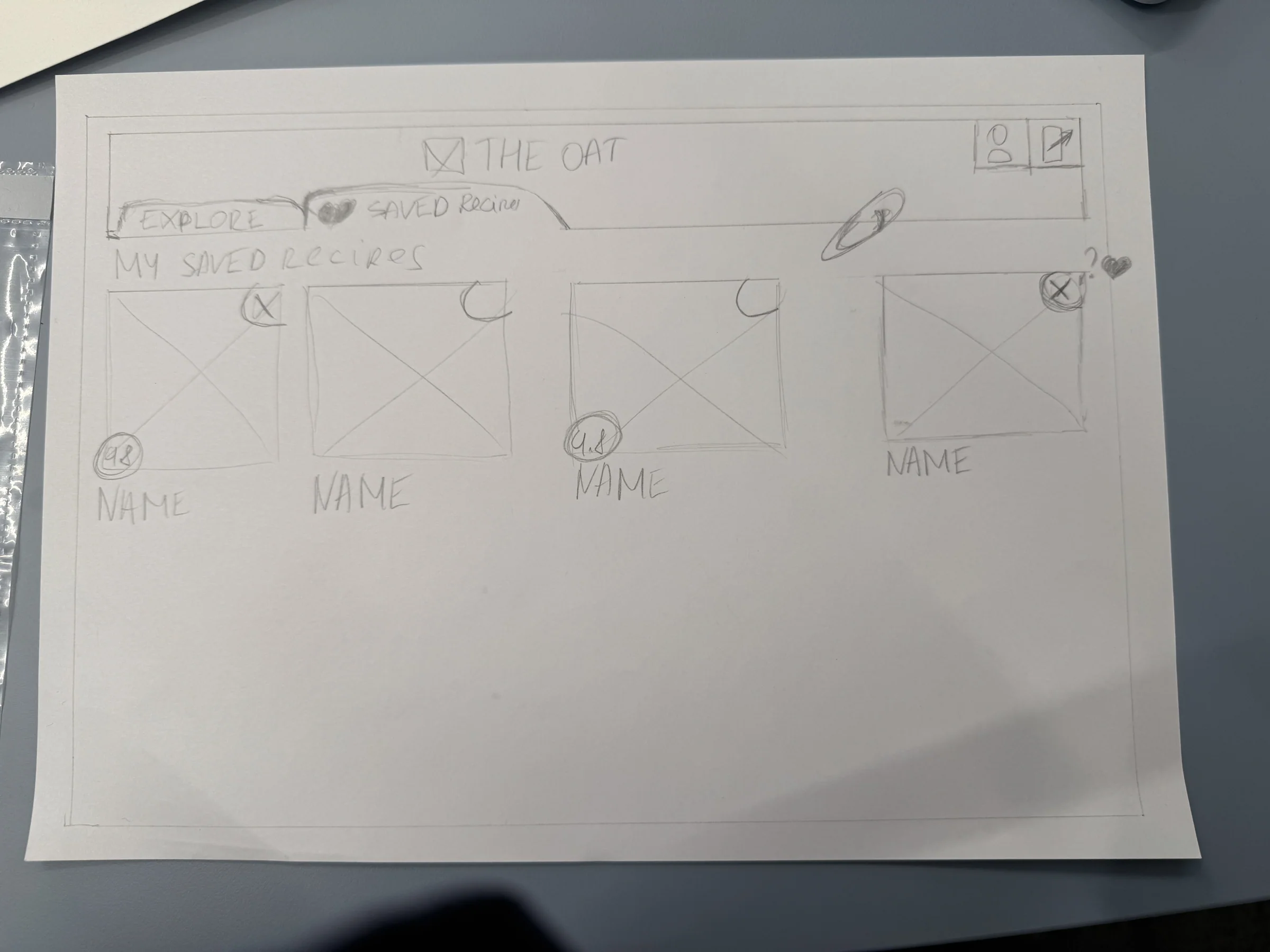
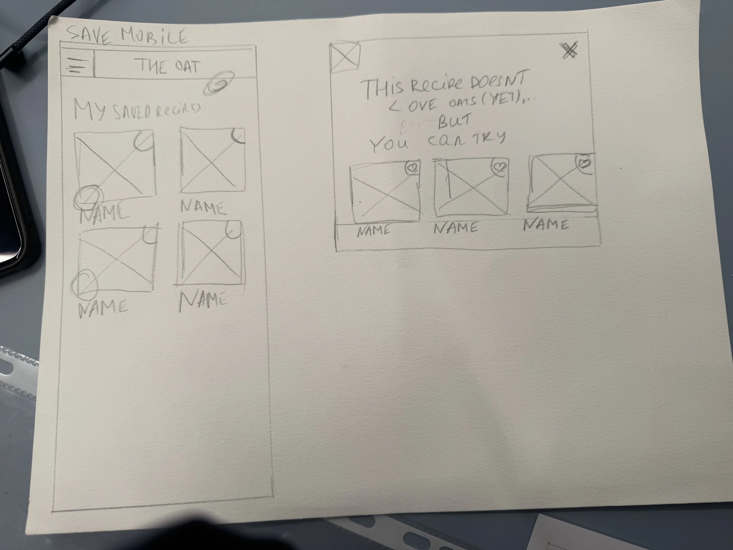
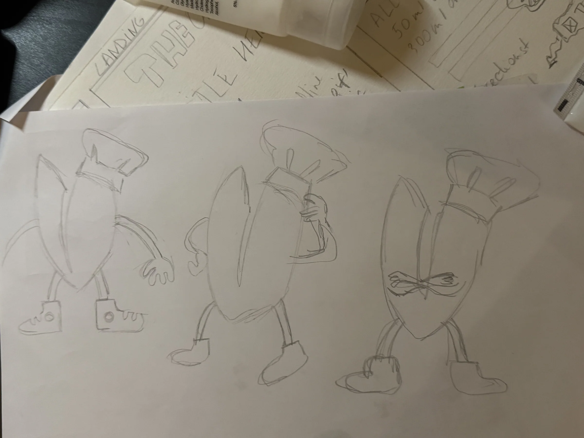
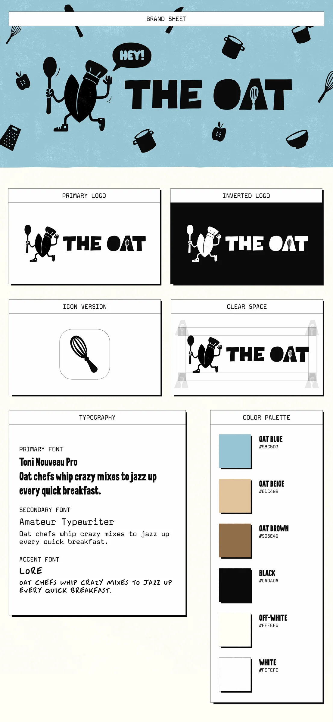
I started on paper, then built wireframes in Figma. For the logo and mascot I tried eight directions.
The final one grows from the oat character Oatly already uses on its website, so it feels like family instead of a stranger.
It had to feel like Oatly
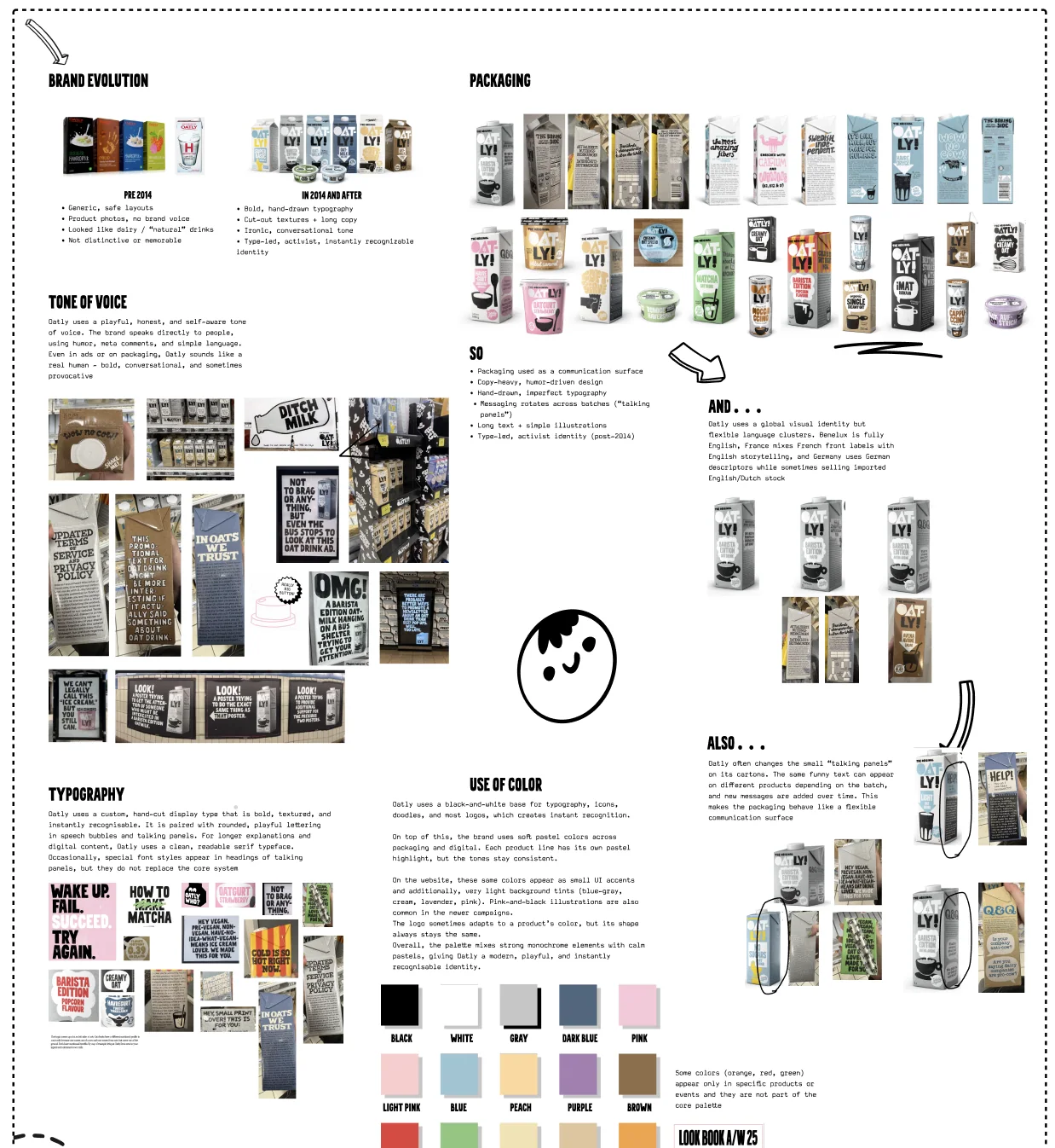
I showed the work to my teachers, who work in design, product, research and business. Their feedback and my research pointed the same way: advice you can trust, one simple interaction and a voice that really sounds like Oatly.
Oatly’s own typeface
I emailed Oatly to ask if I could use their custom typeface, and they said yes. Type is a big part of how you recognise Oatly.
The colours come from Oatly’s world: oat blue, oat beige and oat brown, with warm off-white and black. I animated the mascot in After Effects.
The decisions that mattered
- 01An extension, not another recipe site
People keep cooking on the websites they already know. Nothing new to learn.
- 02An identity that belongs to Oatly
The mascot, the type and the colours all connect to the parent brand, so it feels real.
- 03Help right inside the recipe
The advice shows up where you cook, so you don’t need to jump between tabs.
Out of my comfort zone
Oatly is loud and expressive, and I usually design minimal. Lots of brand research and sketching got me there.
Next time I’d test a working prototype while people actually cook, to see if it really makes them feel sure.
AI helped me turn my logo sketches into quick visuals, then I drew the final artwork myself in Illustrator. I also used it to edit the language of my research paper. The research, the analysis and the ideas are mine.
Ripple